
A Showcase of Identity & Innovation
Every brand has a story, and a logo is the first chapter. From bold corporate identities to playful passion projects, my work spans industries, aesthetics, and strategic needs. Here’s a look at my diverse portfolio of logo design, where I bring visions to life with precision and creativity.

Community & Advocacy
Leading Industry Identities
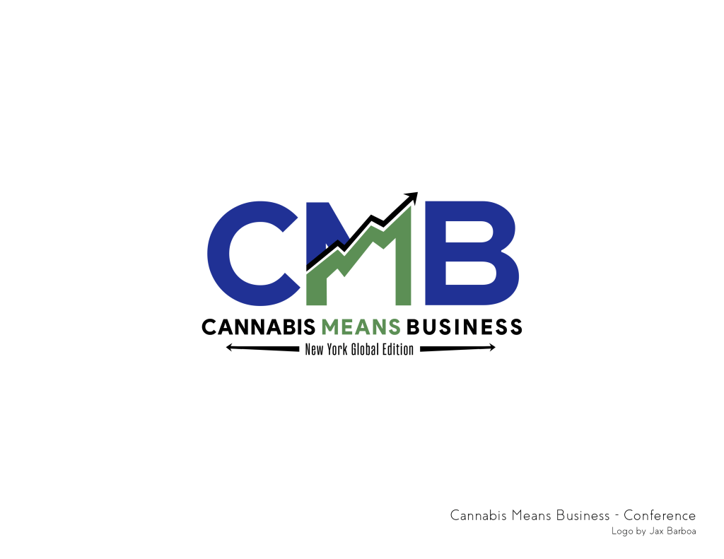
- Cannabis Means Business
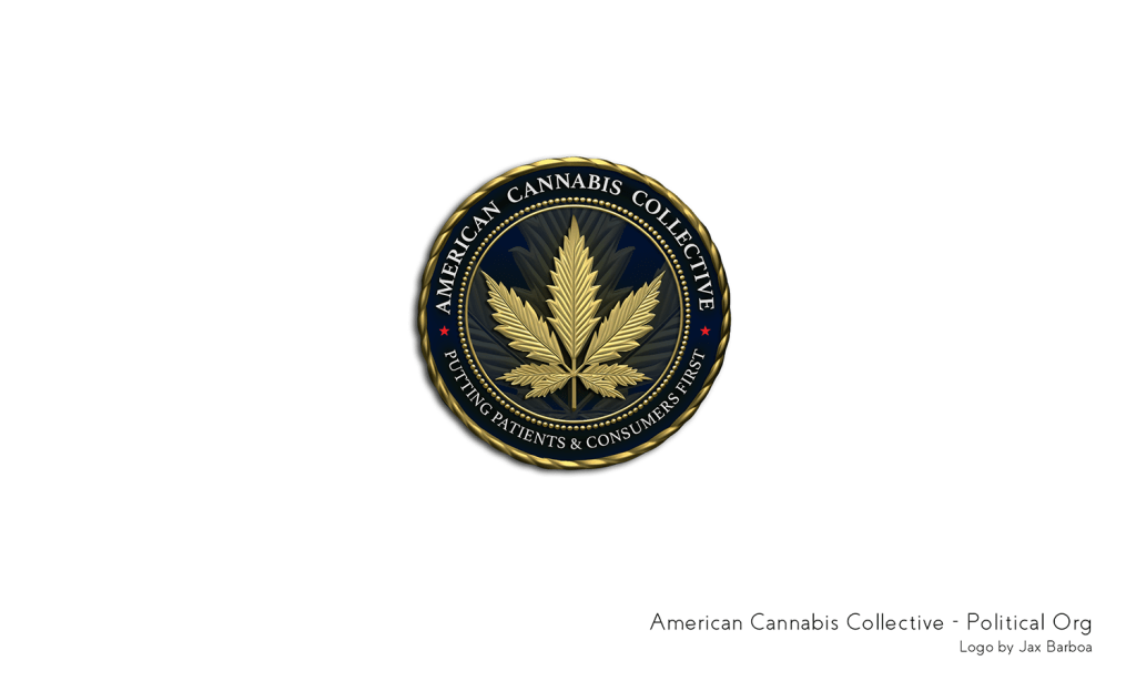
- American Cannabis Collective
- Project Champion
These logos represent my most recent and high-profile branding work in the cannabis industry and advocacy space. Each identity balances bold professionalism with industry relevance, ensuring credibility while standing out. Whether advocating for policy change or positioning a brand for national recognition, these marks are designed to build trust, authority, and momentum.
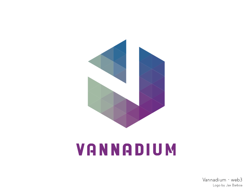
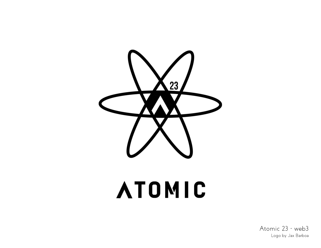
Vannadium & Atomic
A Cohesive Brand System
When branding multiple entities under a single umbrella, visual cohesion is key. Vannadium and Atomic share a custom typography approach and a cutout interplay between letters, creating a seamless but distinct relationship. By using the “V” cutout as the “A” in Atomic, I reinforced the connection between these brands, demonstrating how typography and negative space can tell a subtle but powerful story.


Versatility in Design
Adapting to Any Brand & Vision
Great design isn’t about a single aesthetic—it’s about understanding a brand’s voice and translating it into a powerful visual identity. This collection showcases my range of styles, industries, and approaches, proving my ability to meet any creative brief and align with diverse brand personalities:
- Kaya Events – A sleek, event-driven brand identity balancing elegance and modernity.
- The Herbal Center – A nature-focused, organic design that speaks to wellness and sustainability.
- Caffeine Crawl – Playful and energetic, capturing the essence of a caffeine-fueled adventure.
- Ski Barn – A rugged, vintage-inspired aesthetic with strong, outdoor-focused typography.
- RF – A personal branding mark for a designer, blending simplicity with signature style.
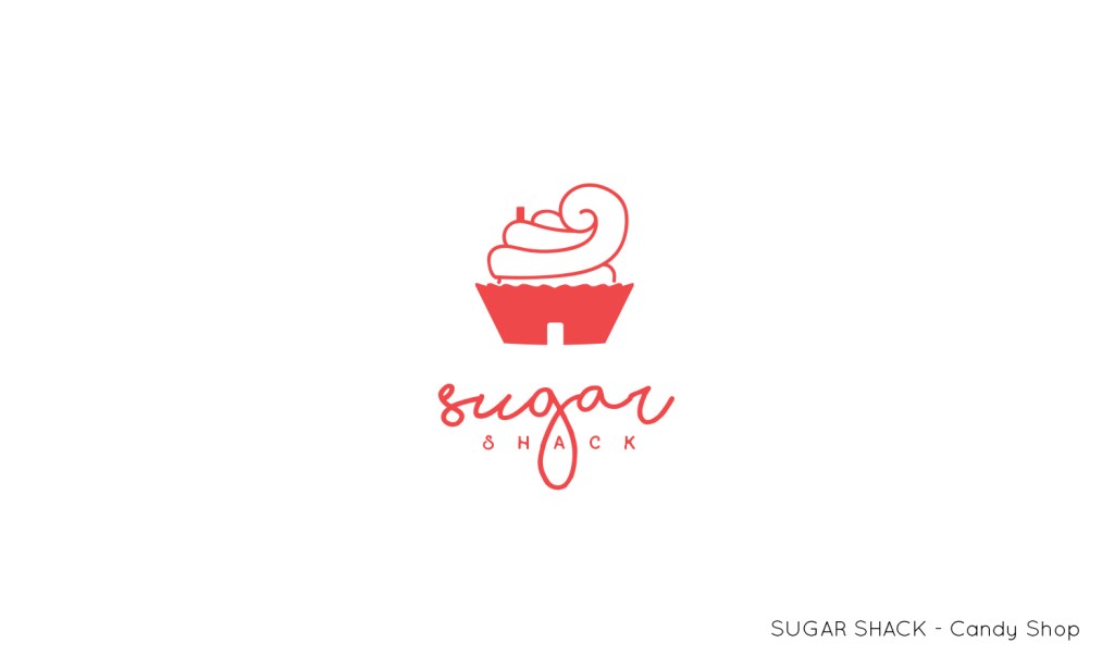
- Sugar Shack – A nostalgic yet fresh take on a classic sweets and treats business.
- Cuda Hada Cannabis Experts – A professional yet inviting logo for a consultancy in the cannabis space.
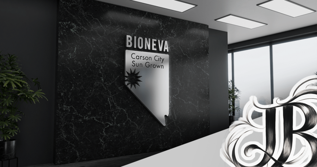
- Bioneva (Carson City Sun Grown) – A sun-inspired, eco-conscious identity for a sustainable brand.
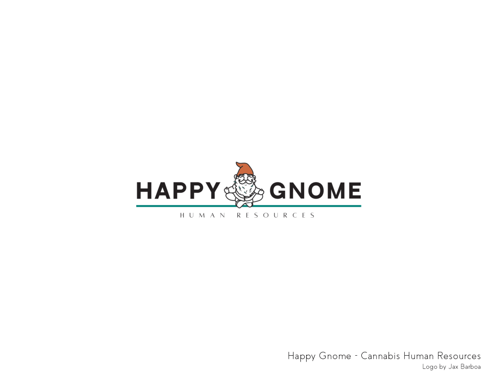
- Happy Gnome Human Resources – A friendly, whimsical take on an HR company with a warm, welcoming feel.
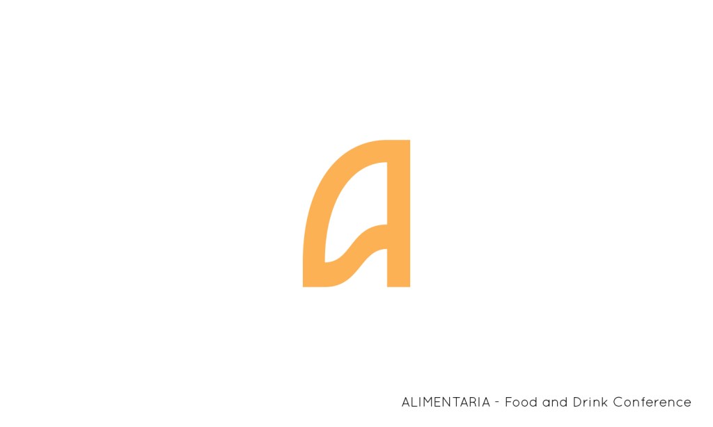
- Alimentaria – A sophisticated, culinary-inspired logo with strong typographic elements.
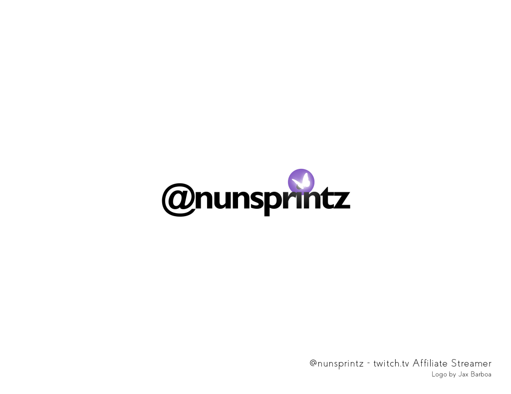
- @nunsprintz – A bold, engaging identity for a Twitch affiliate streamer, designed for high visibility in digital spaces.


CannaPop
Typography in Action
CannaPop’s brand needed to be bold, fun, and full of personality, and I created two distinct logos that showcase my expertise in custom typography and brand adaptability. While both designs share an energetic, playful essence, each takes a unique approach to font style, weight, and movement, proving that a single brand can have multiple engaging visual identities.
Rendezvous Donuts
Startup Energy
For this local startup in Durango, CO, I designed multiple logos to fuel their excitement and vision. The goal was to create branding that felt as delightful and indulgent as the donuts themselves, making potential customers crave a visit before the shop even opened.
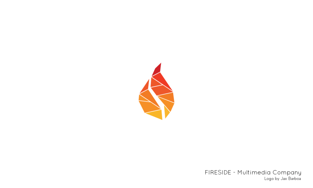
Fireside Homes
Branding for Cozy Living
Fireside Homes needed a logo that embodied comfort, warmth, and mountain living, while still maintaining a professional edge. The primary logo captures this essence, while the alternative mark provides versatility for digital and print applications.
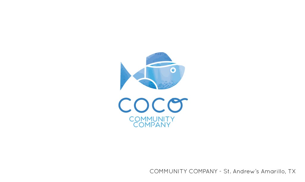
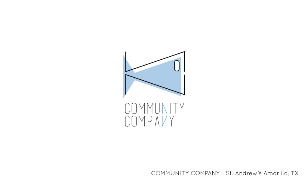
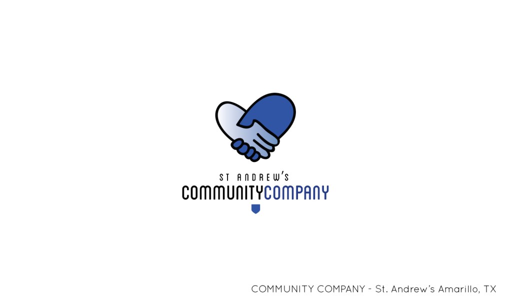
COCO (Community Company)
Community & Faith-Based Branding
One of my earliest branding projects, COCO’s identity work reflects a modern, community-focused approach to church branding. With three different logo variations, this project demonstrates my ability to craft adaptable identities that resonate with diverse audiences.

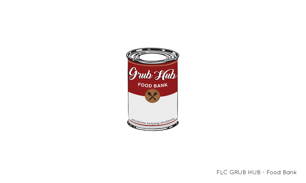
FLC Grub Hub
Balancing Fun & Functionality
When branding a college-based soup kitchen, I had to blend professionalism with approachability. The full logo represents the organization’s mission, while the “mascot”—a can of soup—adds a memorable, lighthearted touch, as per the client’s request.
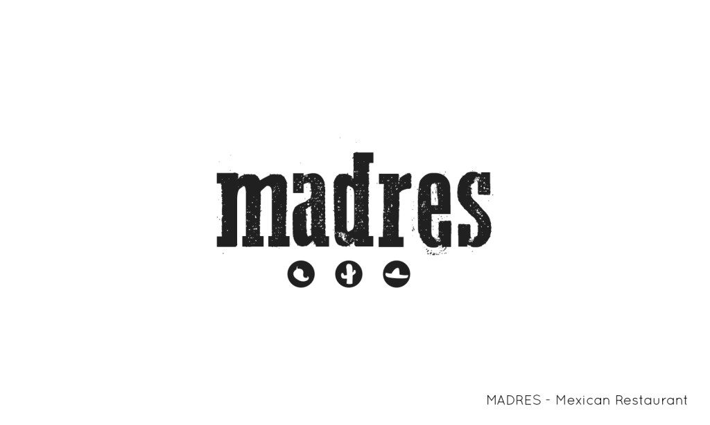
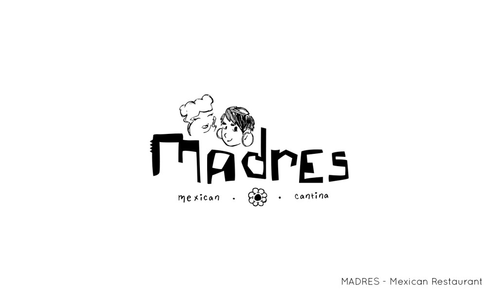

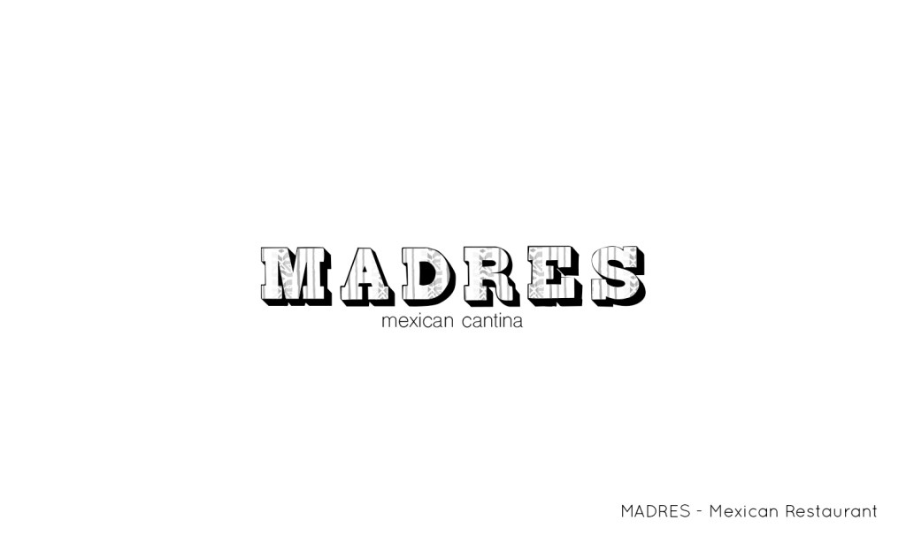
Madres
A Mexican Cantina Concept
As part of a student project, I designed four distinct logo variations for a fictional Mexican cantina, proving my ability to match any style, prompt, or aesthetic challenge. Each version captures a different mood and personality, from traditional to modern, elegant to playful—showcasing my ability to execute diverse branding directions with precision.
A Logo for Every Vision
Logos are more than just symbols—they’re the foundation of a brand’s identity. Whether it’s a corporate powerhouse, a local business, or a passion project, I craft strategic, memorable, and visually impactful logos that tell a story and leave a lasting impression.
💡 Want to see more of my work? Explore my full portfolio to discover how I bring brands to life through thoughtful, engaging design.
Let’s create something unforgettable together!
